top of page


Hiroshima
Appeals
Editorial Design | Book Design | Epub Design
Brief from
NGV Melbourne
Art Book Fair
The Archive
Design Outcome
As restrictions relating to COVID-19 continue to virtualise the culture and creative industries, the design and organisation of material in archives and collections is more and more important. ‘Republishing the archive’ looks at how design can curate archival material, asking: how can we re-evaluate the past through the organisation and design of an archive?
As well as functioning to historicise and preserve knowledge, archives, and their documentation and organisation, offer an opportunity to experience art and design through unique arrangements and logics. They help us make sense of the world through primary material on events, movements, and practices of the past.
The “Hiroshima Appeals” political poster series project was produced to commemorate the first atomic bomb explosion in history. The project aims to bring the appeal for world peace to a mass audience, the posters are designed to give voice to the “Hiroshima’s Spirit” from a pure, neutral standpoint.
The Hiroshima Appeal project was conducted annually from 1983 to 1989. And was reinstated in 2005 to commemorate the 60th anniversary of the end of World War II. Posters were presented to the mayor of Hiroshima City every year as well as distributed widely around the world. Up to now, there are 23 posters in total.
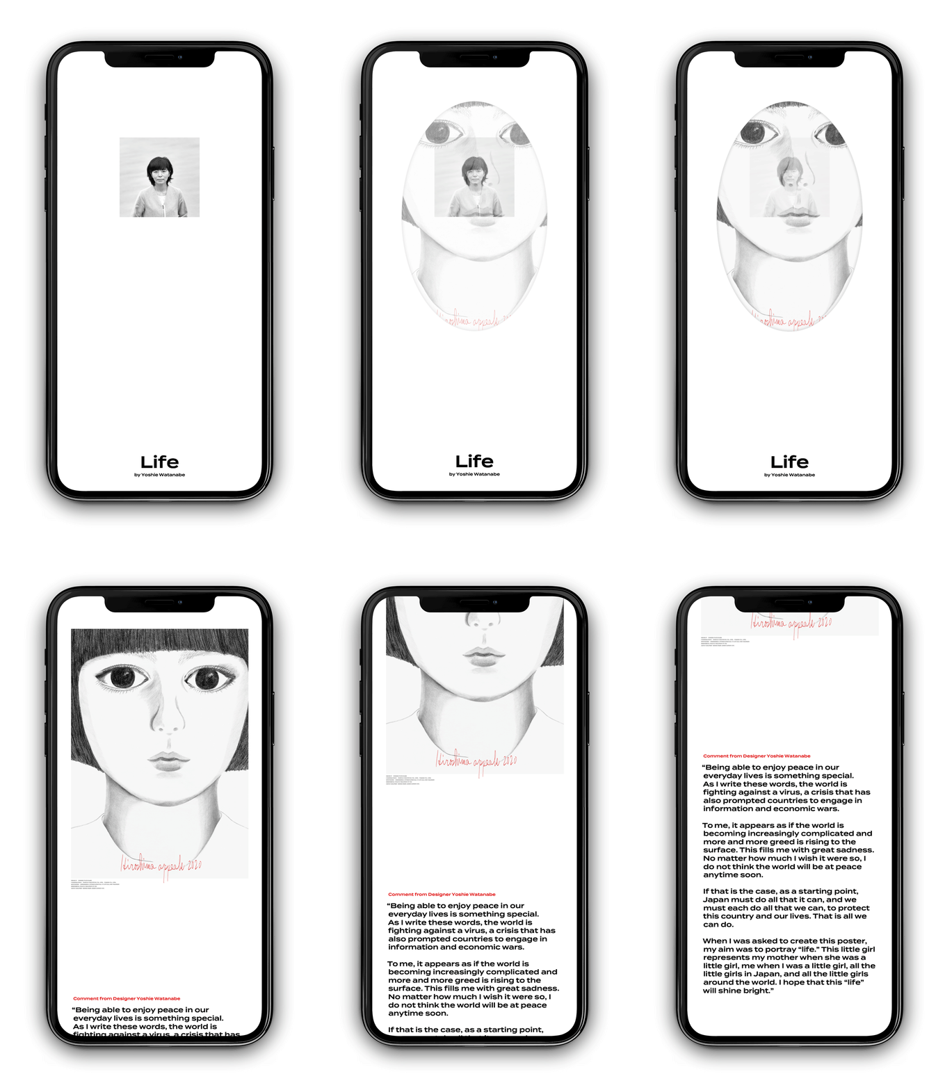
There are two design outcomes: a printed publication archive and one mobile size, online exhibition-like electronic publication.

Publication
My design strategy for the Hiroshima Appeals book Archive is to adopt interactive elements such as laser-cut, pop-up pages, and the use of different paper stocks that can possibly enhance the meaning of posters. In doing so, we can help the audience understand the poster in a better, clearer way, and even add some extra meaning to the posters which can help increase the audience’s reading experience, and make a historical, political archive more interesting to read and easier to understand.
Print


A_1

A-2

2005_2

A_1
1/4
The book archive uses 8.5 by 11 inches size paper. Each poster will come with the title of the poster, year made and designer’s name, followed by designer’s words to help audience understand the poster and the design concept better. There is no fixed style and layout structure in this archive, text style, size, orientation, and position change frequently. The whole archive is using a “Termina” typeface, it's a bit wider, bolder, and heavier compared to many fonts. It's very strong and powerful, I think it helps to convey a better message.

Starting from the 1983 Poster.
A red colour transparent paper has been used on top of the Burning Butterflies poster to enhance the sense of ‘fear’ and ‘bloody’ that the designer wanted to convey how nuclear arms wipe out many lives.


An extended page has been used to show the detail of the original poster.
Text’s orientation is design to follow the poster's orientation and to enhance audience’s reading experience. A repeating text pattern with the word
‘PEACE’ at the back of the poster to represent designer’s
imagination of birds singing ‘PEACE’ in the sky.
A small pop-up page with an image of the Hiroshima city before the explosion has been added on top of the damaged pocket watch to show the beauty of the Hiroshima city before, and create a strong contrast with the damaged pocket watch. I specifically chose a photo with a christian church in the foreground to enhance that contrast, representing the preciousness of peace.


A booklet introducing the history and meaning of the Mad Dog series has
been added. The booklet of the MAD DOGS series give audience a brief understanding of the background and artworks of the MAD DOGS
series, help audience understand the poster better.


An image of the Hiroshima Peace Memorial under designer's word as this poster was inspired by the Hiroshima Peace Memorial. A yellow colour transparent paper has been used on top of the poster representing light.


Electronic

Publication
The ePublication will be visualised as a digital archive exhibition. My aim of this ePublication is to explore the possibility of future publication by integrating the area of curation. I think it is an exploration with great development potential as most publications nowadays, especially mobile versions ePublications, are still in a very early stage even though we already have mature technology and ability to push it further.
My main strategy for this ePublication is to create
a mobile size, epub files that can be published and run on various ebook reader applications and websites such as Apple Books and Google Play Books. The ePublication adopted various interactive functions and animations to create an exhibition experience and enhance the reading experience for readers. It can also add extra meaning to the posters.
Epub


A black background has been used to match with the poster. An arrow has been added to give the audience instruction.
A relerant image has been added for reference as the
poster was inspired by the film Sky over Berlin.


2010_3

2010

2010_5

2010_3
1/5
MAD
DOG


bottom of page


